Don't know how to represent the data as a box plot.
I'm going through an S1 paper, and I'm meant to represent the data from a stem and leaf diagram (which shows the test scores of 19 employees) in the form of a box plot.
I know the basic shape of a box plot:
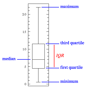
But how do I draw it if the upper quartile is the same as the maximum value?
The test was out of 40, and 5 people received full marks... so the upper quartile and highest value are identical.
I'm not very good at maths Does anybody know how to do it?
It's from the January 2010 exam, if that's any help.
I know the basic shape of a box plot:
But how do I draw it if the upper quartile is the same as the maximum value?
The test was out of 40, and 5 people received full marks... so the upper quartile and highest value are identical.
I'm not very good at maths
Does anybody know how to do it?It's from the January 2010 exam, if that's any help.
Original post by Liam_G
I'm going through an S1 paper, and I'm meant to represent the data from a stem and leaf diagram (which shows the test scores of 19 employees) in the form of a box plot.
I know the basic shape of a box plot:
But how do I draw it if the upper quartile is the same as the maximum value?
The test was out of 40, and 5 people received full marks... so the upper quartile and highest value are identical.
I'm not very good at maths Does anybody know how to do it?
It's from the January 2010 exam, if that's any help.
I know the basic shape of a box plot:
But how do I draw it if the upper quartile is the same as the maximum value?
The test was out of 40, and 5 people received full marks... so the upper quartile and highest value are identical.
I'm not very good at maths
Does anybody know how to do it?It's from the January 2010 exam, if that's any help.
Yeap it's a bit unusual but there's just no whisker for the upper quartile
the 3 marks were awarded for the box (Q1,Q2,Q3 values), the outlier and the whisker in Q1.
I know some people who put a big dot on the Q3 line of the box, others who kind of shaded the end of whisker at the edge of Q3 but you didn't have to do anything at all.
(edited 13 years ago)
Quick Reply
Related discussions
- drawing error bars from standard deviation urgent!!
- Box and whisker plot question.
- KS plot
- aqa biology biodiversity question help!
- Quantitative Skills for Biology
- Quantitative Skills for Biology
- Edexcel GCSE Statistics Paper 2 Higher Tier (1ST0 2H) - 19th June 2023 [Exam Chat]
- More AQA CS NEA Analysis Help!
- Need help with plotting a graph
- AS-level Edexcel Pure Paper 2023, 18th May
- How reliable are grades?
- help maths question a level statistics
- Matlab assignment
- Statistical analysis using prism help please!
- I don't understand how to full explain how to get a solution.
- Do I add anomalies to graphs?
- A question about a combination of signals ?
- UCAS application discussion what are my odds?
- Plotting data on a graph.
- maths question help
Latest
Last reply 1 minute ago
Official Newcastle University Offer Holders Thread for 2024 entryLast reply 2 minutes ago
JP Morgan Degree Apprenticeship 2023Last reply 2 minutes ago
Official London School of Economics and Political Science 2024 Applicant ThreadLast reply 4 minutes ago
AQA A Level French Paper 3 (Speaking/IRP) 7652/3 - 2024 [Exam Chat]Posted 5 minutes ago
Put wrong name on my parents student finance application.Last reply 6 minutes ago
Official Glasgow Caledonian University Applicant Thread for 2024Last reply 7 minutes ago
Software Engineering Degree Apprenticeship | Digital & Technology Solutions Level 6Trending
Last reply 1 week ago
Edexcel A Level Mathematics Paper 2 unofficial mark scheme correct me if wrongMaths
71
Trending
Last reply 1 week ago
Edexcel A Level Mathematics Paper 2 unofficial mark scheme correct me if wrongMaths
71