Lots of big teams ditching trademark designs for horrible kits next season (pics)
Wow plenty of the big European teams are ditching their trademark historical look for some horrible kits next season:
https://www.bbc.co.uk/sport/football/48373140
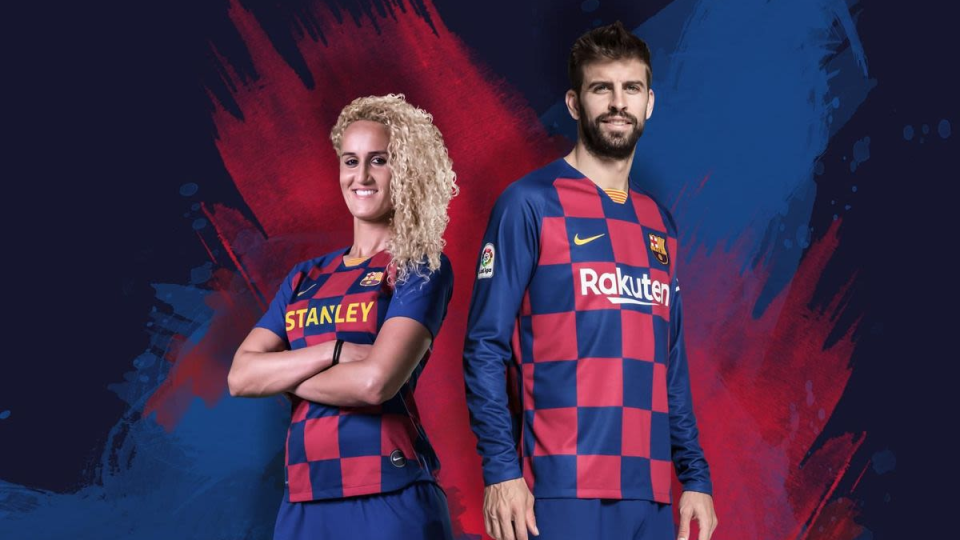
Barcelona in chequerboard??
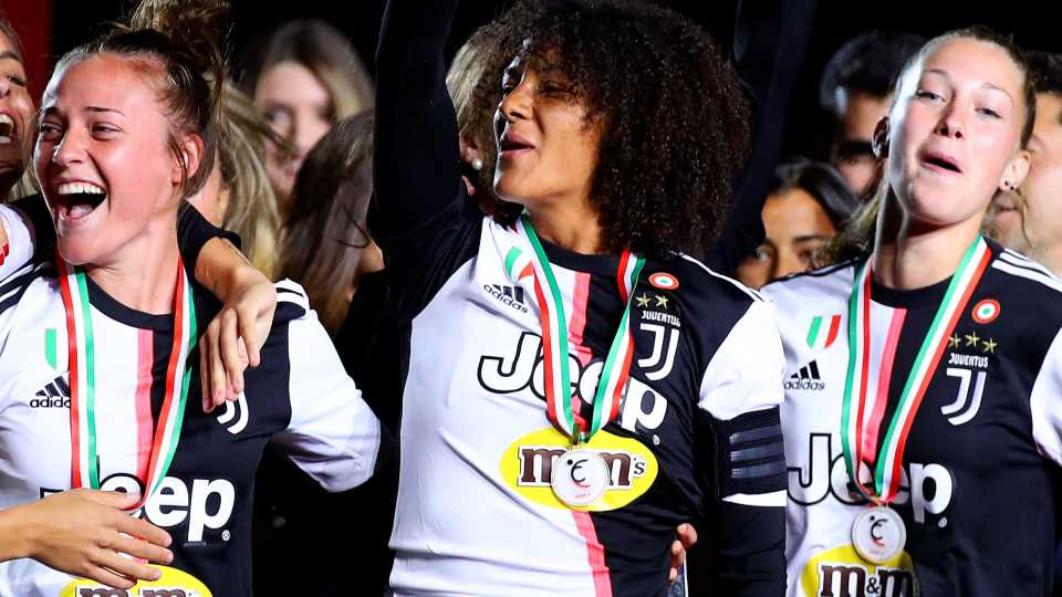
Juventus in half-and-half??? With random pink stripe!
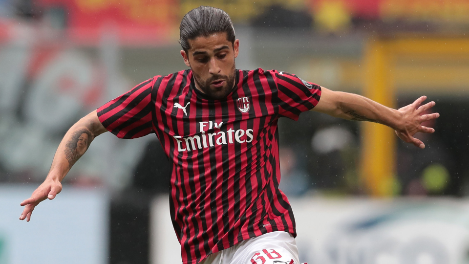
AC Milan have stolen Juventus' and Barcelona's stripes to kill people's eyesight.
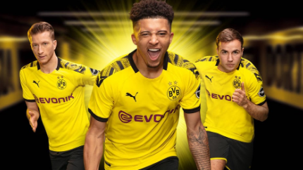
Dortmund are going for 'construction warning' style on their shoulders now. But just through one lonely slim stripe.
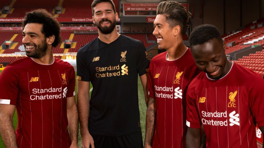
I don't dig the shoulders and sleeves being like a separate part either - Liverpool's look like they steamed on a copy of Liverpool's kit on a blank red shirt from the charity shop for fancy dress.
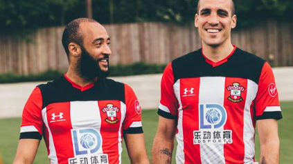
But even Southampton go too far with the shoulder and sleeve thing...
Which new kit out there is your favourite monstrosity?
https://www.bbc.co.uk/sport/football/48373140
Barcelona in chequerboard??
Juventus in half-and-half??? With random pink stripe!
AC Milan have stolen Juventus' and Barcelona's stripes to kill people's eyesight.
Dortmund are going for 'construction warning' style on their shoulders now. But just through one lonely slim stripe.
I don't dig the shoulders and sleeves being like a separate part either - Liverpool's look like they steamed on a copy of Liverpool's kit on a blank red shirt from the charity shop for fancy dress.
But even Southampton go too far with the shoulder and sleeve thing...
Which new kit out there is your favourite monstrosity?
liverpools kit is sexy, dortmund awful tho looks like a swarm of bees
What's exactly wrong with liverpool's? Granted its not the best looking (the last adidas kit was slick) but don't seen anything horrible either.
On the subject of bizarre kits, this has to be up there.

Original post by TaintedLight
What's exactly wrong with liverpool's? Granted its not the best looking (the last adidas kit was slick) but don't seen anything horrible either.
I don't dig the shoulders and sleeves being like a separate part either - Liverpool's look like they steamed on a copy of Liverpool's kit on a blank red shirt from the charity shop for fancy dress.
Original post by sr90
On the subject of bizarre kits, this has to be up there.
I like the fireworks design, I like anything interesting or neon like that, but the Burger King logo just kills it.
The other kit makes everyone look like french fries!
Quick Reply
Related discussions
- Time for Erik Ten Hag to be sacked?
- Tottenham Hotspur Society II
- The Arsenal Thread XXV
- How to create a copyright free logo
- What team do you support and why?
- Help me firm my uni !!
- The Manchester United Thread XXIII
- Everton hit with a 10 point deduction
- The Liverpool FC Thread XVII
- Chelsea F.C. Thread IX
- FA Cup Replays Scrapped!
- The Arsenal Thread XXVI
- What TV show are you currently watching?
- Official 2023 formula one Thread
- Bundesliga
- Will Everton get relegated in 2022/23?
- Design and Technology contexts
- Can a Premier League team win all these in one season or is it impossible?
- Caption competition
- Is Bukayo Saka the face of the Premier League?
Latest
Last reply 2 minutes ago
Official London School of Economics and Political Science 2024 Applicant ThreadLast reply 3 minutes ago
What games did everybody play on their computers at school or when they were youngerGaming
11
Last reply 39 minutes ago
Official University of St Andrews Applicant Thread for 2024Last reply 47 minutes ago
Official Veterinary Medicine Applicants thread 2024 entryLast reply 56 minutes ago
BAE systems degree apprenticeships September 2024Last reply 1 hour ago
What is the difference between ejusdem generis and noscitur a sociis?