Edexcel A2 Economics Unit 3 6EC03 (June 20th 2016) Exam Thread
Scroll to see replies
Original post by NotNotBatman
Why is the answer to this question B? Initially I drew a price/costs/revenue diagram and shifted mc upwards and decreased AR and MR, but this had the effect of price increasing, so I thought, because it says "a firm cuts the price of its product..." it wasn't MC that caused it, so there would be a shift along the MC rather than shifting the whole MC upwards, but that would mean the price is higher. So is there a way I can show it clearly on a diagram as I don't really understand the one on the mark scheme?

You need to split the information it gives you into two parts, and then work out the answer from there.
'Total revenue falls'. If this happens as a result of a reduction in price, then it is evident that demand for the product is inelastic, as a fall in price will lead to a smaller relative rise in output (e.g. price falls by 10, output rises by 5), leading to a fall in total revenue.
'Marginal cost rises'. As you know from the previous part, price has fallen and output has risen. The reason for marginal costs rising as output rises is the law of diminishing returns.
Using these two pieces of information you can deduce that B is the correct answer. To back up the points you make, draw an inelastic demand curve, and a marginal cost curve which is rising. This could be done on the same diagram.
I'd then throw in a knock out point for A stating that 'A is incorrect since if demand was elastic, a fall in price would have likely lead to a rise in total revenue'. You could also knock out B because if TR falls, profit would not increase (unless costs fell by a larger proportion).
(edited 7 years ago)
I don't understand the links between AC, MC, TC, TR, MR etc etc
I know all the definitions for them but would not be able to show their relationships using graphs. Can anyone explain or point me to a resource which simply explains the relationships, preferably with diagrams to illustrate the concept?
Thanks
I know all the definitions for them but would not be able to show their relationships using graphs. Can anyone explain or point me to a resource which simply explains the relationships, preferably with diagrams to illustrate the concept?
Thanks
Original post by study2016
I don't understand the links between AC, MC, TC, TR, MR etc etc
I know all the definitions for them but would not be able to show their relationships using graphs. Can anyone explain or point me to a resource which simply explains the relationships, preferably with diagrams to illustrate the concept?
Thanks
I know all the definitions for them but would not be able to show their relationships using graphs. Can anyone explain or point me to a resource which simply explains the relationships, preferably with diagrams to illustrate the concept?
Thanks
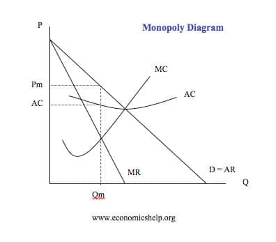
Here you can see that AR (average revenue) is equal to demand. You don't really need to know why this is but if you want to know for context, there are videos explaining it. MR (marginal revenue) is twice a steep as AR. Again, you don't need to know why, but if you want to then you can watch a video explaining it. If demand (AR) shifts left or right, MR will also shift by an equal amount.
MC (marginal costs) will always cross AC (average costs) as the lowest point. Again, feel free to watch a video explaining why this is, as it's probably not the sort of thing I can explain via text.
You need to learn where different firms will produce on the diagram. E.g. profit maximisers produce where MC=MR, as you can see from the diagram above. The difference between AR and AC is the profit area, as seen by the rectangle on the diagram.
In a perfectly competitive market, AR=MR, so the demand curve (D=AR=MR) is perfectly elastic and is drawn as a horizontal line.
This is just basic stuff but read over a textbook/revision guide and watch some videos (econplusdal) which will explain all of the things you need to know.
(edited 7 years ago)
Original post by .JC.
Here you can see that AR (average revenue) is equal to demand. You don't really need to know why this is but if you want to know for context, there are videos explaining it. MR (marginal revenue) is twice a steep as AR. Again, you don't need to know why, but if you want to then you can watch a video explaining it. If demand (AR) shifts left or right, MR will also shift by an equal amount.
MC (marginal costs) will always cross AC (average costs) as the lowest point. Again, feel free to watch a video explaining why this is, as it's probably not the sort of thing I can explain via text.
You need to learn where different firms will produce on the diagram. E.g. profit maximisers produce where MC=MR, as you can see from the diagram above. The difference between AR and AC is the profit area, as seen by the rectangle on the diagram.
This is just basic stuff but read over a textbook/revision guide and watch some videos (econplusdal) which will explain all of the things you need to know.
Thanks - I understand those graphs.
I am talking about the upside-down U diagrams (looks like the Laffer curve diagram) and then the S-shaped TC/TR diagrams.
Sometimes I have seen mark schemes where there are two diagrams one above another with dotted lines being shared by both diagrams simultaneously to show some form of relationship. Those are the ones which I do not understand.
Original post by study2016
Thanks - I understand those graphs.
I am talking about the upside-down U diagrams (looks like the Laffer curve diagram) and then the S-shaped TC/TR diagrams.
Sometimes I have seen mark schemes where there are two diagrams one above another with dotted lines being shared by both diagrams simultaneously to show some form of relationship. Those are the ones which I do not understand.
I'm not sure you necessarily need to know those; I'd just stick to the regular ones.
I think they are just a way of showing separate costs/revenues without using the whole market diagram.
Original post by jamojo12
How can you use the kinked demand theory for evaluation?
Kinked demand theory suggests that in an oligopoly, the price will remain sticky. You can therefore mention this as an evaluation to any question where you talk about price changes/pricing strategies in an oligopolistic market. I.e. kinked demand theory suggests that in an oligopolistic market, the price will not change, and firms will product at an equilibrium point between the elastic and inelastic part of the demand curve. You can proceed to drawn MR on the diagram to show that even if there is a shift in costs, price remains the same.
June 2013 has some of the worst data-responses I have seen.
The 16 markers:
Assess the case for creating an effective market where competition is the downward pressure on prices rather than price cap-regulation.
The 16 markers:
Assess the case for creating an effective market where competition is the downward pressure on prices rather than price cap-regulation.
Original post by A-LevelEconomist
June 2013 has some of the worst data-responses I have seen.
The 16 markers:
Assess the case for creating an effective market where competition is the downward pressure on prices rather than price cap-regulation.
The 16 markers:
Assess the case for creating an effective market where competition is the downward pressure on prices rather than price cap-regulation.
Agreed that entire paper was dreadful.
Original post by CynicalRaven
Agreed that entire paper was dreadful.
Yes the whole egg data response was awful and this one was too, even the MCQ were harder than usual- hoping for a good paper tomorrow.
Original post by A-LevelEconomist
Yes the whole egg data response was awful and this one was too, even the MCQ were harder than usual- hoping for a good paper tomorrow.
Suprisngly the grade boundaries were standard. I honestly thought that the 2015 paper was great which makes me a little bit worried. Hopefully our paper is just as nice with easy to understand questions. Although that being said Q10 was definetly much better than Q9, in my opinion. I would say Jan 2013 is probably the best paper, maybe june 2014.
(edited 7 years ago)
Original post by CynicalRaven
Suprisngly the grade boundaries were standard. I honestly thought that the 2015 paper was great which makes me a little bit worried. Hopefully our paper is just as nice with easy to understand questions. Although that being said Q10 was definetly much better than Q9, in my opinion. I would say Jan 2013 is probably the best paper, maybe june 2014.
Yeah sometimes the case studies seem so straight forward but sometimes they are really awkward, like that egg one.
All I want tomorrow is to look at one of the case studies and like it straight away. No gas market infrastructure monopsony EU egg regulation crap.
Original post by blank101
What are some examples of deregulation?
Privatisation, cutting red tape (for example planning restrictions)
What is the tendering process?
Original post by NotNotBatman
What is the tendering process?
When private firms bid to take on a PFI project and the government selects the best one.
Original post by A-LevelEconomist
When private firms bid to take on a PFI project and the government selects the best one.
is that all we need to know about it?
Quick Reply
Related discussions
- A-level Exam Discussions 2024
- GCSE Exam Discussions 2024
- A Level Exam Discussions 2023
- Edexcel A Level Mathematics Paper 3 (9MA0 03) - 20th June 2024 [Exam Chat]
- Edexcel Past Papers
- Economic's AS + A2 Notes (ALL BOARDS)
- IAL repeats cash in.
- A-level Business Study Group 2022-2023
- Switching from A level to IAL
- Edexcel IAL Business Studies Notes
- GCSE Exam Discussions 2023
- Edexcel A Level Economics A Paper 2 (9ECO 02) - 20th May 2024 [Exam Chat]
- GCSE Biology Study Group 2022-2023
- A-level History Study Group 2022-2023
- Edexcel A-level Spanish Paper 1 (9SP0 01) - 7th June 2024 [Exam Chat]
- A-level Economics Study Group 2022-2023
- Edexcel A-Level French Paper 2 (9FR0 02) - 19th June 2024 [Exam Chat]
- Edexcel A-level Spanish Paper 2 (9SP0 02) - 17th June 2024 [Exam Chat]
- Edexcel GCSE Physics Paper 2 Foundation Triple 1PH0 2F - 16th June 2023 [Exam Chat]
- Edexcel GCSE Geography A Paper 1 (1GA0 01) - 22nd May 2023 [Exam Chat]
Latest
Trending
Last reply 16 hours ago
AQA A Level Economics Paper 2 (7136/2) - 20th May 2024 [Exam Chat]Last reply 16 hours ago
AQA A Level Economics Paper 1 (7136/1) - 15th May 2024 [Exam Chat]Last reply 1 day ago
Edexcel A Level Economics A Paper 1 (9ECO 01) - 15th May 2024 [Exam Chat]Last reply 1 week ago
Edexcel A Level Economics A Paper 2 (9ECO 02) - 20th May 2024 [Exam Chat]Last reply 3 weeks ago
OCR A Level Economics Paper 3 (H460/03) - 5th June 2023 [Exam Chat]Last reply 1 month ago
WJEC A Level Economics Paper 2 (1520U40-1) - 7th June 2024 [Exam Chat]Posted 1 month ago
OCR A Level Economics Paper 2 Macroeconomics (H460/02) - 20th May 2024 [Exam Chat]Posted 1 month ago
OCR A Level Economics Paper 3 (H460/03) - 7th June 2024 [Exam Chat]Posted 1 month ago
AQA A Level Economics Paper 3 (7136/3) - 7th June 2024 [Exam Chat]Last reply 4 months ago
Edexcel A Level Economics A Paper 2 (9ECO 02) Unofficial MarkschemeLast reply 6 months ago
OCR A Level Economics Paper 1 Microeconomics (H460/01) - 18th May 2023 [Exam Chat]Last reply 10 months ago
What was the 25 marker on international competitiveness again?Trending
Last reply 16 hours ago
AQA A Level Economics Paper 2 (7136/2) - 20th May 2024 [Exam Chat]Last reply 16 hours ago
AQA A Level Economics Paper 1 (7136/1) - 15th May 2024 [Exam Chat]Last reply 1 day ago
Edexcel A Level Economics A Paper 1 (9ECO 01) - 15th May 2024 [Exam Chat]Last reply 1 week ago
Edexcel A Level Economics A Paper 2 (9ECO 02) - 20th May 2024 [Exam Chat]Last reply 3 weeks ago
OCR A Level Economics Paper 3 (H460/03) - 5th June 2023 [Exam Chat]Last reply 1 month ago
WJEC A Level Economics Paper 2 (1520U40-1) - 7th June 2024 [Exam Chat]Posted 1 month ago
OCR A Level Economics Paper 2 Macroeconomics (H460/02) - 20th May 2024 [Exam Chat]Posted 1 month ago
OCR A Level Economics Paper 3 (H460/03) - 7th June 2024 [Exam Chat]Posted 1 month ago
AQA A Level Economics Paper 3 (7136/3) - 7th June 2024 [Exam Chat]Last reply 4 months ago
Edexcel A Level Economics A Paper 2 (9ECO 02) Unofficial MarkschemeLast reply 6 months ago
OCR A Level Economics Paper 1 Microeconomics (H460/01) - 18th May 2023 [Exam Chat]Last reply 10 months ago
What was the 25 marker on international competitiveness again?