Rubbish badges
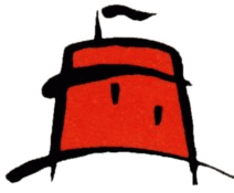
From failed Nandos competitor (Bari), to some sort of badly drawn fez perhaps (eastbourne borough) there are some terrible badges out there, but which is the worst one? For me it has to be the aforementioned Fez thing:
Looks like something from a primary school art class...
Looks like something from a primary school art class...
Scroll to see replies


 looks like a ****ing cartoon.
This is just ugly!


Original post by Wilfred Little
looks like a ****ing cartoon.
looks like a ****ing cartoon.Fake Manu badge
The Bangladeshi champions.
Original post by Woahmypenisisbig
Fake Manu badge
Fake Manu badge
I know you're trolling but someone on here will probably believe you so... we were the first club to have that on our crest and it goes way back to the 1800's.
Man U's crest in the 70's - http://upload.wikimedia.org/wikipedia/en/archive/f/f9/20100107010021!Manchester_United_Badge_1960s-1973.png
They pinched it off us if anything (which they didn't, but we were first), and the idea for it came from Salford City Reds as their nickname is The Red Devils.
Oldham. Would be more suitable for Hogwarts than a founder member of the Premier League.
Bari. Twinned with Nandos?
Newell's Old Boys. Nothing to be said.
Hereford. That poor cow looks upset, or grumpy.
Barnsley. I know they don't have an illustrious history, but a cartoon bulldog? Come on.
Spoiler
Bari. Twinned with Nandos?
Spoiler
Newell's Old Boys. Nothing to be said.
Spoiler
Hereford. That poor cow looks upset, or grumpy.
Spoiler
Barnsley. I know they don't have an illustrious history, but a cartoon bulldog? Come on.
Spoiler
Original post by sr90
Newell's Old Boys. Nothing to be said.
Spoiler
That reminds me of these:
http://en.wikipedia.org/wiki/Deportivo_****a#Outside_football
Full name Club Deportivo ****a
Nickname(s) "Los ****eros"
Nickname(s) "Los ****eros"

Their crest is crap too.

EDIT - I can't post it, will get banned for avoiding the swear filter. The club name is Deportivo Banka but starts with a W not a B on the 2nd word.
(edited 10 years ago)
Original post by Wilfred Little
looks like a ****ing cartoon.
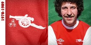
looks like a ****ing cartoon.Have to admit I hate the new badge for a number of reasons. 1)Blue is in it for the first time...2)Looks soulless and corporate 3)Cannon facing the wrong way.
Think there's only two options for an A.F.C badge
1)A version of the Art-Deco classic, gives a flavour of Highbury.

2) Simply a cannon. Very understated, very classy. Very Arsenal
---
Alternatively if we're feeling a bit egotistical then just throw a gold version on the shirts to go with our solid gold invincibles EPL trophy innit.


This is my new favourite thread ever.
Original post by Zürich
2) Simply a cannon. Very understated, very classy. Very Arsenal
---
---
That is what I was gonna suggest, except without the cannon balls. 2nd row on the left - http://img.photobucket.com/albums/v622/LeeJH/Crests.png That looks smart.
That first one you posted looks **** imo. I've never liked the letters overlapping each other (Rangers, Real Madrid, Blues even had it one year).
Considering some of the new ones coming out now (your cartoon corporate one, Man U's minus the 'football club', Everton's current monstrosity and Man City's with the infamous three stars that commemorate no actual achievement*) we could do a lot worse than our current one. Still has 'FC' on it and is just an updated version of an old (1923) crest anyway.
*Seriously. They were included to give the crest a more 'continental' feel.
Fulham's is absolutely terrible. They had a lovely old fashioned one before they got promoted.

This thread should be renamed "which football team don't you support".
Cardiff City have to be up there. Crest is awful...
Original post by sr90
Hereford. That poor cow looks upset, or grumpy.
Hereford. That poor cow looks upset, or grumpy.
Spoiler
If your face had to be on the Hereford kit you too would be upset and grumpy. The poor thing, but it's a bull not a cow.
Estoril - Something that was created on paint.
Surely Columbus Crew are worth a shout too?

Quick Reply
Related discussions
- your question's answered IDEA bronze and silver
- pronouns on name badge?
- IDEA Gold Award
- Silver idea award
- What SIA security badge is worth training for?
- Traitors
- iDEA Silver Badge - Citizen Foundation - Interview acceptance email
- Idea maker silver bade
- Idea badge 3 coding thingy mibob
- What do the little purple sheild thingies mean next to your name?
- hi guys
- Badges
- Idea Badge Silver The Digital Detective 3 Level 7
- Claims that a 9 year-old boy was treated poorly by staff ‘because he’s Jewish’
- Twin Taboo.
- Idea Silver Maker Two Badge (Coding)
- idea cyber spies bronze
- What’s the best car to buy???
- IDEA Silver award Maker badge one?
- [Stuck] iDEA Gold Award - Fake News Detector