This discussion is now closed.
Check out other Related discussions
- MATHSS
- s6 subject choices
- Audio files for GCSE French Listening??
- Igcse
- Subject choices help to get into dentistry?
- Which A level subject should I drop?
- higher spanish vs higher art?
- Help!!
- Picking the right subjects for University ( Higher or Advanced Higher art?)
- Subject Choices
- please recommend apprenticeships to do with art & design and fashion & textiles
- Mature Student thinking of going back to uni
- Edinburgh vs KCL for English
- what do i do?
- What's my likelihood of getting accepted for Law at the university of Edinburgh?
- S5 Highers
- Art gcse
- Oxbridge application with weaker Junior Cert?
- Prelims result
- Getting into Scottish medical school
Higher Art 2009
Scroll to see replies
xo-Heva
I'm short for time but I'll go through as much as possible. I hope you don't mind abreviations! lol
Focal Point
What is FP?
What is in painting?
How does this affect the FP?
What makes FB so? eg colour, texture.
Atmosphere
General mood of painting.
How would you feel eg sad, lonely, happy, relaxed.
Evidence from painting to support oppinion eg facial expressions if any, pattern, light/dark...
Colour
General colour scheme? Hot/Cold/strong/pastle...
Describe colours used eg lemon yellow
Colour theory
Standing out colours.
Tone
Ties in with colour. Range of colours used.
Why has this been done eg 3D look, flat look etc.
Range?
Light source.
Texture
Brush strokes? Hairy/dabbed/wild/smooth
Describe different textures and areas where they are
Opinion
End on personal note
"I think that..."
Like/Dislike
-----------------------------------
Aesthetics
Look good?
Colour/texture
inspired by
Cost
Estimated cost
Why?
Good value for money?
Customer
Design aimed at who?
How will they use it?
Impact on customers life?
Environment
Where will you see the product (on body obv, but where abouts)
How is it worn?
What impact will it have upon surroundings?
Safety
Has the designer considered safety?
Is it jaggy? Will it catch?
Is it safe for children?
What impliments has the designer used to make safe? if any...
Size
Is it in proportion?
If change, would improve appearance?
Function
What is purpose?
How well does it meet it?
Materials
Describe materials
Techniques used to make?
Would an alternative be better?
----------------------------------
Phew! Hope this helps. I don't have time to go into further detail, I'm sorry. Remember, this is only a 10 mark essay, you don't have to remember it all! Don't spend too much time on this, spend more time on questions B.
Good luck and let me know how it goes!!
xxxx
Aww, thank you soo much, thats gonna really help mee
 i appreciate it, must have took you a wee while to do that! Thankssss
Well im off to do some more last minute revision lol.
Arts my last exam ---> PARTAAAAY!

Thank you, i will do. Good Luck to you 2 xxx
cloudbusting
I'm not that worried about the exam. It just requires a lot of ************ which is something I'm pretty talented at! I want an A so so bad but I have no idea what the standard will be like. I'll attatch photos of my folio.
My final looks so much better in real life. Sigh.
My final looks so much better in real life. Sigh.
that expresive could get you into the edinburgh sqa exhibition
i was in it with my expressive and i think yours could be better than some of the others from last year.
robin22391
that expresive could get you into the edinburgh sqa exhibition
i was in it with my expressive and i think yours could be better than some of the others from last year.
i was in it with my expressive and i think yours could be better than some of the others from last year.
Wow, you think so? That would be my ultimate goal but I won't pin my hopes on it! When did you find out yours was in the exhibition?
Did anyone else do portraiture? I spewed up a lot of bull about the guy being on a cross like a martyr or maybe having conflicing morals. I love making stuff like that up haha. I wasn't keen on the outfit for Fashion Design though.
13 pages of writing.
Did anyone have lines in their book btw? Ours were blank sheets which really annoyed me as my writing looks horribly wonky...
Hand hurt like a bitch afterwards but I think I've done pretty well.
I hated the picture for still life though. Had no texture or tone to comment on >.<
Oh well... Counting down the days to R-Day now.
cloudbusting
Wow, you think so? That would be my ultimate goal but I won't pin my hopes on it! When did you find out yours was in the exhibition?
Did anyone else do portraiture? I spewed up a lot of bull about the guy being on a cross like a martyr or maybe having conflicing morals. I love making stuff like that up haha. I wasn't keen on the outfit for Fashion Design though.
Did anyone else do portraiture? I spewed up a lot of bull about the guy being on a cross like a martyr or maybe having conflicing morals. I love making stuff like that up haha. I wasn't keen on the outfit for Fashion Design though.
i found out last year about the time of the exam results. portraiture is a bit like the cartoon question in higher history, objects and definition can have alot of meaning. last year that women looked evil, hence the red paint.
claireeex
The still life was horrific, it asked what was succesfull and admirable and i was like nothing.. a fiver year old could do better. Textiles was pretty bad too.
Oh well least its done, deffoz didnt do as good as usual
Oh well least its done, deffoz didnt do as good as usual
yeah, still life was awful.
What kind of things did you comment on?¬!
[QUOTE="claireeex"]The tone, how things were cut off, bad composition, the messy style, bad use of media since some things could barely be made out, bad lines. Didnt have anything nice to say really [/QUOTE
Awryt, suprisingly i said quite a few good things haha!
I was gonna say it was messy but then didnt, cause i thougt that obv the person who done it thought it was a masterpiece.
[/QUOTEAwryt, suprisingly i said quite a few good things haha!
I was gonna say it was messy but then didnt, cause i thougt that obv the person who done it thought it was a masterpiece.
For the still life section I said;
A cropped composition meant the picture was like a window into the artist's life and a view of what his life is like.
The random, busy and messy presentation of the objects seemed very natural unlike a lot of still life compositions, and suggested that his life was equally messy and random.
The use of only 2 colours/limited colour palette looked like an old photo - perhaps showing an aspect of the artist's past.
The use of strong light colour in the top and right hand side of the picture and dark at the bottom and left hand side created a sense of balance behind the busyness of the items on the desk.
The piece is ironic because on the desk there are several unfinished pictures and the piece itself looks unfinished, as if it could be one of the pictures on the table.
The lack of attention to detail makes the picture difficult to see.
The limited use of colour can be percieved as dull and murky.
For the fashion/textile design I said;
The spikes on the coat are like the teeth of a dinosaur (although on second thought it did look a bit like a cactus, or it could be like the spines on the back of a dinosaur).
The plainness of the coat body contrasts with the colour of the flowers on the shoulders and chest.
The heavy, strong woollen felt reflects the strength and presense of a dinosaur, whereas the delicate silk used to make the flowers represents the vulnerablity of the flowers - the designer has chosen materials that reflect the characteristics of the creature they represent.
The coat is cumbersome and would be difficult to wear.
The white wool would be very easily tarnished which makes it difficult to wear outside, even though coats are designed to be worn outside.
The materials aren't very durable, would not be able to machine wash them.
The coat would be warm and so could be worn on cold, but not wet, days.
I ran out of time so my part about my designers was really short
bananaslug77
For the still life section I said;
A cropped composition meant the picture was like a window into the artist's life and a view of what his life is like.
The random, busy and messy presentation of the objects seemed very natural unlike a lot of still life compositions, and suggested that his life was equally messy and random.
The use of only 2 colours/limited colour palette looked like an old photo - perhaps showing an aspect of the artist's past.
The use of strong light colour in the top and right hand side of the picture and dark at the bottom and left hand side created a sense of balance behind the busyness of the items on the desk.
The piece is ironic because on the desk there are several unfinished pictures and the piece itself looks unfinished, as if it could be one of the pictures on the table.
The lack of attention to detail makes the picture difficult to see.
The limited use of colour can be percieved as dull and murky.
For the fashion/textile design I said;
The spikes on the coat are like the teeth of a dinosaur (although on second thought it did look a bit like a cactus, or it could be like the spines on the back of a dinosaur).
The plainness of the coat body contrasts with the colour of the flowers on the shoulders and chest.
The heavy, strong woollen felt reflects the strength and presense of a dinosaur, whereas the delicate silk used to make the flowers represents the vulnerablity of the flowers - the designer has chosen materials that reflect the characteristics of the creature they represent.
The coat is cumbersome and would be difficult to wear.
The white wool would be very easily tarnished which makes it difficult to wear outside, even though coats are designed to be worn outside.
The materials aren't very durable, would not be able to machine wash them.
The coat would be warm and so could be worn on cold, but not wet, days.
I ran out of time so my part about my designers was really short
A cropped composition meant the picture was like a window into the artist's life and a view of what his life is like.
The random, busy and messy presentation of the objects seemed very natural unlike a lot of still life compositions, and suggested that his life was equally messy and random.
The use of only 2 colours/limited colour palette looked like an old photo - perhaps showing an aspect of the artist's past.
The use of strong light colour in the top and right hand side of the picture and dark at the bottom and left hand side created a sense of balance behind the busyness of the items on the desk.
The piece is ironic because on the desk there are several unfinished pictures and the piece itself looks unfinished, as if it could be one of the pictures on the table.
The lack of attention to detail makes the picture difficult to see.
The limited use of colour can be percieved as dull and murky.
For the fashion/textile design I said;
The spikes on the coat are like the teeth of a dinosaur (although on second thought it did look a bit like a cactus, or it could be like the spines on the back of a dinosaur).
The plainness of the coat body contrasts with the colour of the flowers on the shoulders and chest.
The heavy, strong woollen felt reflects the strength and presense of a dinosaur, whereas the delicate silk used to make the flowers represents the vulnerablity of the flowers - the designer has chosen materials that reflect the characteristics of the creature they represent.
The coat is cumbersome and would be difficult to wear.
The white wool would be very easily tarnished which makes it difficult to wear outside, even though coats are designed to be worn outside.
The materials aren't very durable, would not be able to machine wash them.
The coat would be warm and so could be worn on cold, but not wet, days.
I ran out of time so my part about my designers was really short
WOW, you picked up on loads in teh still life, i didnt pick up on all of that - DAMMITTTT!
Amzzz
WOW, you picked up on loads in teh still life, i didnt pick up on all of that - DAMMITTTT!
Aw, sorry I didn't mean to worry you
 I was curious as to what other people put compared to mine.
 Seriously though, art is quite simple to pick up marks in as long as you can argue your point
That's what I love about it - you can make stuff up (like I did) and as long as you argue it you will get the marks hi guys! im doing higher art this year so i will be the higher art 2010 student LOL but i was wondering, will making a dress be very difficult? I want to design a dress for my design unit..but i have no sewing skills etcetc to make any piece of clothing whatsoever.......i was also thinking of maybe a mask or jewelerry? arghh...any reccomendations?
strawberryilicious
hi guys! im doing higher art this year so i will be the higher art 2010 student LOL but i was wondering, will making a dress be very difficult? I want to design a dress for my design unit..but i have no sewing skills etcetc to make any piece of clothing whatsoever.......i was also thinking of maybe a mask or jewelerry? arghh...any reccomendations?
Hey, Do whatever YOU want to do, dont let any1 else tell you.
Pick something you will enjoy designing and have lots of ideas for.
Cz if your doing a dress you could always get your mum or some1 to help
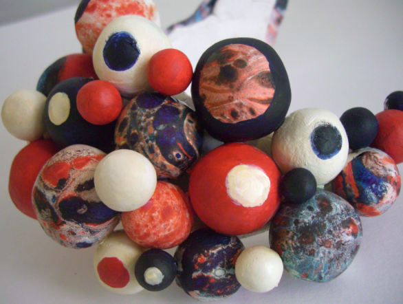
I done jewellery last year and that was pretty fun.
Its purely up2 u tho!
strawberryilicious
hi guys! im doing higher art this year so i will be the higher art 2010 student LOL but i was wondering, will making a dress be very difficult? I want to design a dress for my design unit..but i have no sewing skills etcetc to make any piece of clothing whatsoever.......i was also thinking of maybe a mask or jewelerry? arghh...any reccomendations?
No, it'll be quite easy.
You'll be amazed how quickly you get the hang of it.
I'm doing a few dresses this year in Avd Higher
At the start of last year I had never even made a tote bag but its really very easy!
http://www.threadbanger.com
Thats a good website to go on. If you have any trouble, ask on the forums and they'll give you a hand.
Or you can ask me and I'll see if I can help
can someone give me the names of some contempory jewellery designers ?
Related discussions
- MATHSS
- s6 subject choices
- Audio files for GCSE French Listening??
- Igcse
- Subject choices help to get into dentistry?
- Which A level subject should I drop?
- higher spanish vs higher art?
- Help!!
- Picking the right subjects for University ( Higher or Advanced Higher art?)
- Subject Choices
- please recommend apprenticeships to do with art & design and fashion & textiles
- Mature Student thinking of going back to uni
- Edinburgh vs KCL for English
- what do i do?
- What's my likelihood of getting accepted for Law at the university of Edinburgh?
- S5 Highers
- Art gcse
- Oxbridge application with weaker Junior Cert?
- Prelims result
- Getting into Scottish medical school
Latest
Trending
Last reply 5 hours ago
SQA Higher Physics - Paper 2 - 25th April 2024 [Exam Chat]Last reply 2 days ago
SQA Nat 5 English - Critical Reading - 7th May 2024 [Exam Chat]Last reply 6 days ago
SQA Higher Mathematics - Paper 1 Non-calculator - 13th May 2024 [Exam Chat]Last reply 2 weeks ago
SQA Higher English - Critical Reading - 9th May 2024 [Exam Chat]Trending
Last reply 5 hours ago
SQA Higher Physics - Paper 2 - 25th April 2024 [Exam Chat]Last reply 2 days ago
SQA Nat 5 English - Critical Reading - 7th May 2024 [Exam Chat]Last reply 6 days ago
SQA Higher Mathematics - Paper 1 Non-calculator - 13th May 2024 [Exam Chat]Last reply 2 weeks ago
SQA Higher English - Critical Reading - 9th May 2024 [Exam Chat]