HNC Maths Question Hand Drawn Sketch
the question is:
d) The Quality Assurance Department is anxious to improve the nominal value of the resistors to ensure more of them fall within the rated tolerance band. The manufacturing process is adjusted in an attempt to bring about this improvement. Following the adjustment, a further sample of 100 resistors is taken in order to determine if the adjustment has resulted in an improvement to the nominal value of the resistors. Analysing this second sample, it is noted that the mean value is now 21.8kΩ, with a standard deviation of 1kΩ. By comparing these new results of the resistor values following the manufacturing adjustment, with the values obtained in part (c) recorded before the adjustment, show whether or not you agree with the hypothesis that the adjustment to the manufacturing process has had a beneficial effect by making the resistor values closer to the desired manufactured nominal value of 22kΩ. Illustrate your answer with a hand drawn sketch of the normal distribution, with shaded regions representing the results of your analysis, which you can show to the Quality Assurance Manager.
i have got the answer for the 2 parts to compare but im unsure on how the graph should look and what i should be shading.
Scroll to see replies
Original post by csutton18
the question is:
d) The Quality Assurance Department is anxious to improve the nominal value of the resistors to ensure more of them fall within the rated tolerance band. The manufacturing process is adjusted in an attempt to bring about this improvement. Following the adjustment, a further sample of 100 resistors is taken in order to determine if the adjustment has resulted in an improvement to the nominal value of the resistors. Analysing this second sample, it is noted that the mean value is now 21.8kΩ, with a standard deviation of 1kΩ. By comparing these new results of the resistor values following the manufacturing adjustment, with the values obtained in part (c) recorded before the adjustment, show whether or not you agree with the hypothesis that the adjustment to the manufacturing process has had a beneficial effect by making the resistor values closer to the desired manufactured nominal value of 22kΩ. Illustrate your answer with a hand drawn sketch of the normal distribution, with shaded regions representing the results of your analysis, which you can show to the Quality Assurance Manager.
i have got the answer for the 2 parts to compare but im unsure on how the graph should look and what i should be shading.
d) The Quality Assurance Department is anxious to improve the nominal value of the resistors to ensure more of them fall within the rated tolerance band. The manufacturing process is adjusted in an attempt to bring about this improvement. Following the adjustment, a further sample of 100 resistors is taken in order to determine if the adjustment has resulted in an improvement to the nominal value of the resistors. Analysing this second sample, it is noted that the mean value is now 21.8kΩ, with a standard deviation of 1kΩ. By comparing these new results of the resistor values following the manufacturing adjustment, with the values obtained in part (c) recorded before the adjustment, show whether or not you agree with the hypothesis that the adjustment to the manufacturing process has had a beneficial effect by making the resistor values closer to the desired manufactured nominal value of 22kΩ. Illustrate your answer with a hand drawn sketch of the normal distribution, with shaded regions representing the results of your analysis, which you can show to the Quality Assurance Manager.
i have got the answer for the 2 parts to compare but im unsure on how the graph should look and what i should be shading.
Any help from anyone?
Original post by csutton18
Any help from anyone?
It sounds like they want a sketch of a normal distribution (with appropraite std dev) with the desired and estimated means on there. If there is a test value, you may want to shade the appropriate critical region(s) on there.
(edited 1 year ago)
so would this be a bell curve with my mean value as the middle and upper and lower values at each end? for example a curve going from 19 to 24 with the peak being at the mean of 21.
sorry if it sounds daft im on a distance learning course so don't actually get any classroom time just work books.
sorry if it sounds daft im on a distance learning course so don't actually get any classroom time just work books.
Original post by csutton18
so would this be a bell curve with my mean value as the middle and upper and lower values at each end? for example a curve going from 19 to 24 with the peak being at the mean of 21.
sorry if it sounds daft im on a distance learning course so don't actually get any classroom time just work books.
sorry if it sounds daft im on a distance learning course so don't actually get any classroom time just work books.
It partially depends on the previous question parts, but the normal distribution for the second sample (this question part) would have the mean given and rather than the population normal distribution which you seem to be suggesting, Id use the normal distribution corresponding to the mean estimate of the second sample, so the std dev isnt 1 KOhm
(edited 1 year ago)
Ok. So the mean value given for this part is 21.8kohm and the values they’re looking for are between 19kohm and 24kohm. So that’s where I got the bell chart with 19 and 24 from (if this is correct) but I don’t know what I should be high lighting under the graph with the answers I have got.
Original post by csutton18
Ok. So the mean value given for this part is 21.8kohm and the values they’re looking for are between 19kohm and 24kohm. So that’s where I got the bell chart with 19 and 24 from (if this is correct) but I don’t know what I should be high lighting under the graph with the answers I have got.
The question is a bit ambiguous and Ive not seen the previous question parts/answers so not 100% sure what it means by "moving closer" to 22. Id probably be more interested in seeing the uncertainty (std dev/normal distribution) associated with the mean estimate of 21.8, rather than (possibly in addition to) the population normal distribution which you seem to be thining about.
Original post by mqb2766
...
I suspect this is the original. @csutton18 to confirm.
Hopefully it's come out with sufficient resolution.
Original post by ghostwalker
I suspect this is the original. @csutton18 to confirm.
Hopefully it's come out with sufficient resolution.

Hopefully it's come out with sufficient resolution.
Correct this is the original
Original post by ghostwalker
I suspect this is the original. @csutton18 to confirm.
Hopefully it's come out with sufficient resolution.
Hopefully it's come out with sufficient resolution.
That makes a bit more sense, though the different sample sizes / standard deviations for the two samples makes a naive comparison, which I suspect they're after, a bit more approximate. For the sample in d) you (OP) have a mean estimate and you want to test whether its closer to 22, than 21.5. If youre asking about the sketch, you must have done this - what did you get? For the sketch you could illustrate 2 things
1) How the mean estimate (parts c and d) normal distributions compare to the desired mean and each other
2) How the population normal distributionns (parts c and d) meet the 22 +/-10%, so how much lies outside.
They're two different things and Id guess the question part is asking about the former (1). So as a best guess I'd sketch the normal distribution associated with the mean estimate in (d) and mark on where 21.5 and 22 lie in it, so illustrating if 21.8 is significantly closer to 22 than 21.5 which is ~the hypothesis test.
(edited 1 year ago)
Original post by mqb2766
That makes a bit more sense, though the different sample sizes / standard deviations for the two samples makes a naive comparison, which I suspect they're after, a bit more approximate. For the sample in d) you (OP) have a mean estimate and you want to test whether its closer to 22, than 21.5. If youre asking about the sketch, you must have done this - what did you get? For the sketch you could illustrate 2 things
1) How the mean estimate (parts c and d) normal distributions compare to the desired mean and each other
2) How the population normal distributionns (parts c and d) meet the 22 +/-10%, so how much lies outside.
They're two different things and Id guess the question part is asking about the former (1). So as a best guess I'd sketch the normal distribution associated with the mean estimate in (d) and mark on where 21.5 and 22 lie in it, so illustrating if 21.8 is significantly closer to 22 than 21.5 which is ~the hypothesis test.
its plotting the graph im having an issue with as my work book says there is an equation of (1/(sqrt(2*pi)))*(e^(-(x^2)/2)) (in graphs software) but this is just for a standard bell curve so it doesn't help because the work book doesn't break down what each part is so i don't know where i should be inputting my answers into the equation to get a curve i need.
Original post by csutton18
its plotting the graph im having an issue with as my work book says there is an equation of (1/(sqrt(2*pi)))*(e^(-(x^2)/2)) (in graphs software) but this is just for a standard bell curve so it doesn't help because the work book doesn't break down what each part is so i don't know where i should be inputting my answers into the equation to get a curve i need.
Its easier to say what you do understand, but a normal distribution is defined by the two parameters (mean and standard deviation). The mean represents the centre of the curve and the standard deviation determines the width. Roughly "all" (99.7% of the area) of the bell curve lies between
mean +/- 3 std dev
Similarly 95% lies between
mean +/- 2 std dev
So something like
https://www.pqsystems.com/qualityadvisor/DataAnalysisTools/capability_4.1.php#:~:text=Sketch%20a%20picture%20of%20a,curve%2C%20cutting%20it%20in%20half
or just google how to sketch a normal distribution
(edited 1 year ago)
Original post by mqb2766
Its easier to say what you do understand, but a normal distribution is defined by the two parameters (mean and standard deviation). The mean represents the centre of the curve and the standard deviation determines the width. Roughly "all" (99.7% of the area) of the bell curve lies between
mean +/- 3 std dev
Similarly 95% lies between
mean +/- 2 std dev
So something like
https://www.pqsystems.com/qualityadvisor/DataAnalysisTools/capability_4.1.php#:~:text=Sketch%20a%20picture%20of%20a,curve%2C%20cutting%20it%20in%20half
or just google how to sketch a normal distribution
mean +/- 3 std dev
Similarly 95% lies between
mean +/- 2 std dev
So something like
https://www.pqsystems.com/qualityadvisor/DataAnalysisTools/capability_4.1.php#:~:text=Sketch%20a%20picture%20of%20a,curve%2C%20cutting%20it%20in%20half
or just google how to sketch a normal distribution
cheers that website was a great help. what scale do i plot on the y axis though i now know how the x axis should look but just want to make sure i have my y axis going up to the correct place or does this not really matter?
Original post by csutton18
cheers that website was a great help. what scale do i plot on the y axis though i now know how the x axis should look but just want to make sure i have my y axis going up to the correct place or does this not really matter?
The scaling on the y-axis isnt really important and with a simple bell curve it could be omitted as youre really interested in comparing relative areas, not specific heights. However, the x-axis scaling is important (mean and std dev).
Original post by mqb2766
The scaling on the y-axis isnt really important and with a simple bell curve it could be omitted as youre really interested in comparing relative areas, not specific heights. However, the x-axis scaling is important (mean and std dev).
cheers for the help!
Hi sorry for the bump, I am also doing this question on my distance course (after many years of little maths)
Im not sure if i am mis-understanding the question after browsing this thread, I was going to draw two distribution graphs one for the first set with mean of 21.5 std of 2 and another for the newer set of 21.8 std of 1 and show how more of the curve is shaded on the second graph showing more resistors fall within the 19-24 area. used desmos to graph them and will have to hand draw them, am i on the right track or is it asking something else?
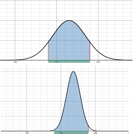
Im not sure if i am mis-understanding the question after browsing this thread, I was going to draw two distribution graphs one for the first set with mean of 21.5 std of 2 and another for the newer set of 21.8 std of 1 and show how more of the curve is shaded on the second graph showing more resistors fall within the 19-24 area. used desmos to graph them and will have to hand draw them, am i on the right track or is it asking something else?
Original post by OsirisMB
Hi sorry for the bump, I am also doing this question on my distance course (after many years of little maths)
Im not sure if i am mis-understanding the question after browsing this thread, I was going to draw two distribution graphs one for the first set with mean of 21.5 std of 2 and another for the newer set of 21.8 std of 1 and show how more of the curve is shaded on the second graph showing more resistors fall within the 19-24 area. used desmos to graph them and will have to hand draw them, am i on the right track or is it asking something else?
Im not sure if i am mis-understanding the question after browsing this thread, I was going to draw two distribution graphs one for the first set with mean of 21.5 std of 2 and another for the newer set of 21.8 std of 1 and show how more of the curve is shaded on the second graph showing more resistors fall within the 19-24 area. used desmos to graph them and will have to hand draw them, am i on the right track or is it asking something else?
Hi it’s definitely 1 graph, I was thinking the same as you originally. I can double check for you on Tuesday at the latest when I’m back at my computer because I can’t fully remember what the scale should be but it’s a lot simpler than I was expecting.
Original post by OsirisMB
Hi sorry for the bump, I am also doing this question on my distance course (after many years of little maths)
Im not sure if i am mis-understanding the question after browsing this thread, I was going to draw two distribution graphs one for the first set with mean of 21.5 std of 2 and another for the newer set of 21.8 std of 1 and show how more of the curve is shaded on the second graph showing more resistors fall within the 19-24 area. used desmos to graph them and will have to hand draw them, am i on the right track or is it asking something else?
Im not sure if i am mis-understanding the question after browsing this thread, I was going to draw two distribution graphs one for the first set with mean of 21.5 std of 2 and another for the newer set of 21.8 std of 1 and show how more of the curve is shaded on the second graph showing more resistors fall within the 19-24 area. used desmos to graph them and will have to hand draw them, am i on the right track or is it asking something else?
Found my marked up copy quick enough I done a graph of -3 to +3 with like 99% of it shaded in and got a tick so it really is that simple. Hope that helps.
Original post by OsirisMB
Thanks that helps a lot  now just to start the laborious task of typing it all up and trying to figure out references lol
now just to start the laborious task of typing it all up and trying to figure out references lolNo worries. I only had 1 reference and that was the workbook they provided. Good luck anyway.
Quick Reply
Related discussions
- Hnc maths
- HNC Maths U2 A1 2D
- Hnc electrical engineering maths question
- help needed please
- Hypothesis Testing
- HNC science
- Lenz law
- Maths
- No level 3s and trying to find a way into Engineering as a 23 year old.
- HNC or Foundation
- Distance learning HNC with Unicourse
- What can I do with an HNC in Games Development?
- As level maths mechanics question - help!!!!
- electrical schematics and analyzing signals
- Vectors
- Isaac Physics help
- Can someone please solve this?
- C3 Trig question
- HNC Social science..
- Help urgent maths
Latest
Trending
Last reply 4 days ago
Did Cambridge maths students find maths and further maths a level very easy?Last reply 2 weeks ago
Edexcel A Level Mathematics Paper 2 unofficial mark scheme correct me if wrongMaths
71
Trending
Last reply 4 days ago
Did Cambridge maths students find maths and further maths a level very easy?Last reply 2 weeks ago
Edexcel A Level Mathematics Paper 2 unofficial mark scheme correct me if wrongMaths
71


